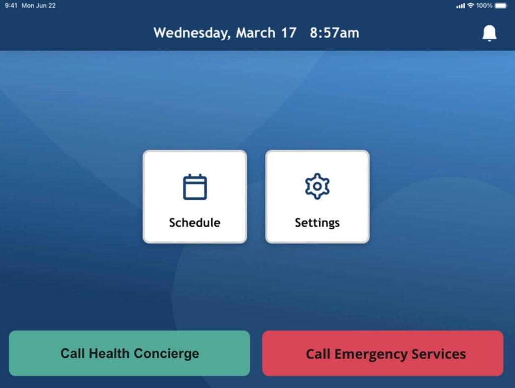
Everyone deserves good design. Today, the vast majority of older adults 65 and over own smartphones. But are we designing websites for older adults? To design for accessibility means to be inclusive to the needs of all users, no matter their age or abilities.
In conducting user research for own digital products, our design team has interviewed scores of older adults and honed a set of guidelines specific to adults 65 and over. Our senior designer, Adam Girardot, says throw away all your preconceptions of seniors. There’s a wide range of digital aptitude across this population, and no one size fits all. Below, Adam shares five things to keep in web design for older adults.
UX design for visually impaired users
As we age, our eyesight weakens. It becomes harder to focus on close objects, distinguish between colors, and see peripheral areas of a screen. Our pupils also become less responsive to changes in lighting. This might explain why older adults need more light to read yet squint in the bright sunlight. In healthcare app development for elderly, follow these guidelines for users with visual impairment:
Use contrast in your UX design
Contrast refers to the difference between colors, shades, or tones. It helps us identify objects within a view or distinguish them from a backdrop. We rely on shadow, tone, and color to identify objects in a field of vision, such as a car coming toward us on a road. As we age, we experience decreased contrast sensitivity and various types of color blindness. So when designing for older adults, consider these tips:
- Create high contrast between text and its background
- Stick to a color pallet with high-contrast and visually distinguishable colors
- Avoid low-contrast text, such as light-gray typeface on white
- Avoid patterned or picture backgrounds
- Perform a color test using a tool like Contrast Checker

Focus on large designs
Web design for seniors is an exercise in minimalism. Less is more because you need room for very large type. In our user studies, older adults consistently request bigger typefaces, which means less real estate on the page for other content. As a designer, it’s hard to sacrifice beauty and harmony for a big, loud typeface, but it could mean the difference between a user interacting with your screen or simply leaving it.
- Use larger font size and typeface, 24pt body weight instead of 16pt
- Use simple-looking large type, such as san serif
- Include only the most important information on a page
- Enlarge features to enable easier and more accurate clicking
- Provide big, simple icons with broad outlines

Remove distracting design choices
As we age, we begin to lose our peripheral vision. By ages 70- 80, most of us will have lost nearly a third of our ability to see content outside our central field of vision. As a result, older users will have some degree of tunnel vision and less ability to see peripheral areas of a screen.

We also lose selective attention, or the ability to tune out distracting information (see below). When there’s too much information on a webpage, it can be overwhelming to an older user. Distractions can interfere with the way our brains process information and complete tasks. Older adults don’t necessarily see a screen through a designer’s eyes. So think and design like a minimalist – less is more when considering UX design for the elderly.

When approaching website design for seniors who may experience tunnel vision and selective attention, consider the following:
- Group and position related items close together
- Minimize content on the margins
- Limit the color pallet to fewer than three colors
- Reduce the amount of a content on a page
UX design for hearing impaired users
Utilize visual and audio designs
Hearing loss is one of the most common conditions affecting older adults. Just like vision, hearing impairment comes in many forms, but in adults, the most common hearing loss is due to age-related changes in the ear or auditory nerve. When building apps for older adults, consider the following:
- Use pictures, symbols, and large graphics in tandem with audio prompts
- Offer multimodal options
- For notifications, allow users to select vibration or blinking lights in place of sound
- Offer captioning or transcripts for video content
- Integrate word prediction software and speech-generating programs
- Offer female and male voices for people who struggle to hear either low or high tones
- Design for assistive technology: integrate with hearing aids (some offer Bluetooth connection)
UX design for users with motor deficits
Avoid unnecessary motion
With advanced age comes a decline in fine motor control. As the central nervous system declines, it affects our ability to perform activities such as pointing a mouse or clicking a button. Today, most older adults own a computer or a smartphone, but many have difficulty using a mouse and keyboard or manipulating a mobile device. Here are some tips when designing for adults with declining motor skills:
- Minimize movement between UI elements
- Create large links and buttons that remain in a static position
- Minimize pointer gestures such as swiping or dragging
- Keep scrollbars visible and simple
- Use breadcrumb navigation to orient the user
- On desktops, make all functions available from the keyboard
UX design for seniors is just great design
As the average age of a smartphone user increases, so will an expanding population of users that will expect inclusive and universal design. Apps designed and other custom software for older adults and accessibility require specialized skills, including considerable user research and careful thought before putting a pointer to a pixel. Take the time to ask a lot of questions. Prepare for surprises. And start every UX journey with a lot of empathy.


