Turning nuclear performance data into actionable insight
Designing cross-functional data visualizations that give INPO leadership a clear, unified picture of plant performance — from C-suite strategy to field-level operations.
Data-driven decision making for nuclear safety
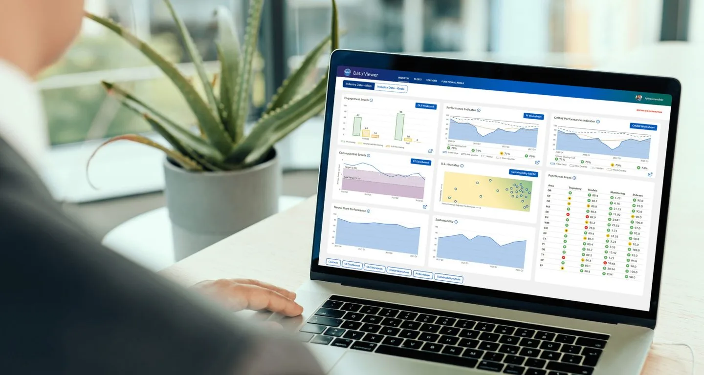
The Institute of Nuclear Power Operations (INPO) sets industry-wide performance objectives, criteria, and guidelines for nuclear power plant operations. Their leadership needed a centralized way to tell a story with their data — connecting models and metrics to provide a clear picture of past, present, and future plant performance.
As part of our broader INPO engagement, Digital Scientists designed interactive data visualizations aligned with PowerBI and Tableau capabilities — from stakeholder interviews through validated prototypes ready for implementation.
Client
INPO (Institute of Nuclear Power Operations)
Industry
Energy, Nuclear Power, Nonprofit
Services
Data Visualization Design, UX Research, Product Strategy, Alignment Workshops, Interactive Prototyping
Engagement
October – December 2023
Method
Capabilities
“Digital Scientists has a track record of being very responsive, quickly taking in issues, whether it be a defect or an adjustment on a feature based on what people are saying. That’s instilling a lot of confidence in our INPO staff as well as our executive sponsor. I wanted to take a moment and give you my heartfelt thank you for doing what you’re doing.”

Angie Hensley
Program Director — Institute of Nuclear Power Operations
No central location for cross-functional data storytelling
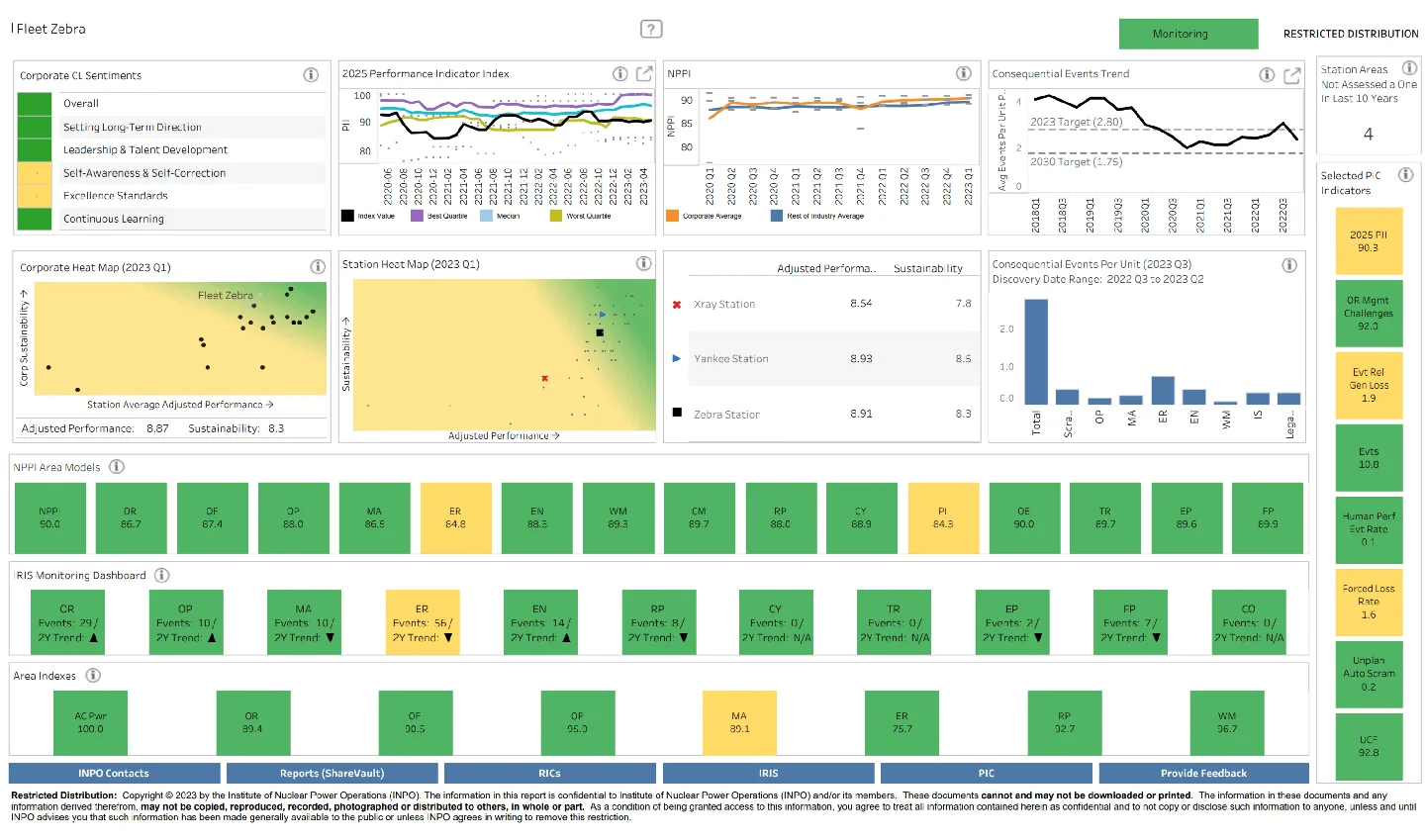
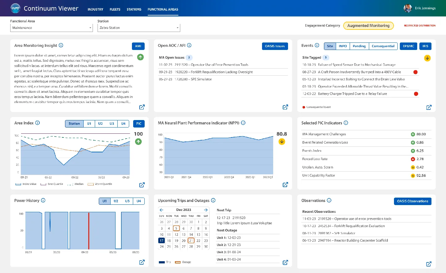
INPO’s existing Tableau dashboards suffered from poor organization, limited insights, and muddy visual hierarchy. Leadership needed visualizations that could serve users at every level — from executives making strategic decisions to workers monitoring daily operations.
Balanced models and metrics to accurately picture past, present, and future performance
Key contributors and insights at multiple levels — from C-suite executives to plant workers
Interactive prototypes aligned with PowerBI and Tableau capabilities for practical implementation
Evolved visualizations that improve comprehension and align with INPO’s brand identity
From cluttered dashboards to clear data storytelling
Before
Original dashboards: poor organization, limited insights, muddy hierarchy
After
Redesigned: branded visualizations, clear hierarchy, customizable views
Research, prototype, validate
Over three months, we followed a structured process — starting with deep user research, translating findings into interactive prototypes, and validating with real users before handoff.
User Research
Build a foundation through stakeholder interviews and asset assessment
- Alignment workshop
- Stakeholder interviews
- Working sessions
- Product evaluations
- Finding synthesis
Concept Prototype
Define the vision for data visualization UX and build interactive prototypes
- Information architecture
- Wireframes
- Visual design direction
- Interactive Figma prototype
- Concept storyboards
Validate & Refine
Test with real users, gather insights, and iterate before handoff
- User validation sessions
- Insight synthesis
- Prototype refinement
- Final acceptance & handoff
From raw data to strategic narrative
The final data visualization prototypes deliver a holistic view of key contributors and insights — designed for implementation within INPO’s existing PowerBI and Tableau environments.
Macro to micro insights
A holistic view spanning executive strategy down to operational performance, letting users drill from high-level trends to specific plant data
User adoption through data storytelling
Leadership’s greatest risk was creating something stakeholders wouldn’t use. Enhanced data storytelling ensured buy-in from day one
Platform-ready prototypes
Visualization designs grounded in the capabilities and constraints of PowerBI and Tableau, ensuring practical implementation
Brand-aligned visual identity
Evolved from generic Tableau defaults to branded, purposeful visualizations that improve comprehension
Ready to tell a story with your data?
From nuclear safety dashboards to enterprise analytics, we design data visualizations that turn complexity into clarity. Let’s discuss your project.