An interactive Apple TV app for 1,500+ KICKR Experience stations
Designing and developing an interactive Apple TV app for 1,500+ KICKR Experience stations worldwide—transforming passive in-store displays into self-guided, data-driven demo experiences.
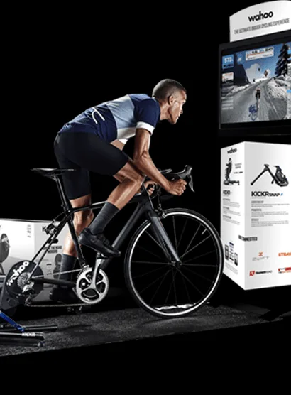
Turning experience stations into autonomous sales tools
Wahoo Fitness specializes in the creation of Bluetooth-enabled fitness equipment oriented toward year-round cyclist training. Wahoo partners with cycling and sport retailers worldwide to offer customers a hands-on, in-store experience with its most popular product, the KICKR Smart Trainer.
With approximately 1,500 KICKR Experience stations deployed globally, Wahoo needed a way to attract customers, demonstrate the full ecosystem of products, and capture leads—all without relying on store employees. The stations were underperforming: Apple TVs went to sleep, remotes got lost, and there was no way to track who tried the product.
Digital Scientists partnered with Wahoo for a two-phase engagement: a rapid 6-week proof of concept to validate the approach, followed by a 10-week MVP build that shipped a native Apple TV app to the App Store.

Client
Wahoo Fitness
Industry
Fitness Technology, Retail, IoT
Services
Design & Development, UX Research, Usability Testing
Platforms
Apple TV (tvOS), Web Admin (Rails)
Timeline
16 weeks (6-wk POC + 10-wk MVP)
Method
KICKR Stations Globally
POC Validated
MVP Delivered
Concept to App Store
1,500 experience stations with no one watching
The KICKR Experience stations represent some of the most important real estate Wahoo owns—but they were underperforming. Without dedicated store employees, customers walked right past them. The Apple TV displayed screensavers instead of product demos. Remotes disappeared. There was no way to know who tried the product or which stores even had stations running.
Employee-Dependent
Stations relied solely on store employees to demo the product. No employee, no experience.
No Customer Data
Unable to track who tried the KICKR or which stores had active stations.
Technical Friction
Apple TV sleep mode, lost remotes, Bluetooth connectivity issues plagued every location.
No Product Education
Couldn’t showcase the KICKR, CLIMB, and HEADWIND ecosystem without a knowledgeable employee.
What the KICKR Experience needed to accomplish
Attract foot traffic without employee intervention
Provide a self-guided 5–10 minute demo experience
Educate customers on the full Wahoo product ecosystem
Capture customer contact info for follow-up marketing
Eliminate dependency on the Apple TV remote
Provide real-time analytics across all store locations
Six weeks from kickoff to validated prototype
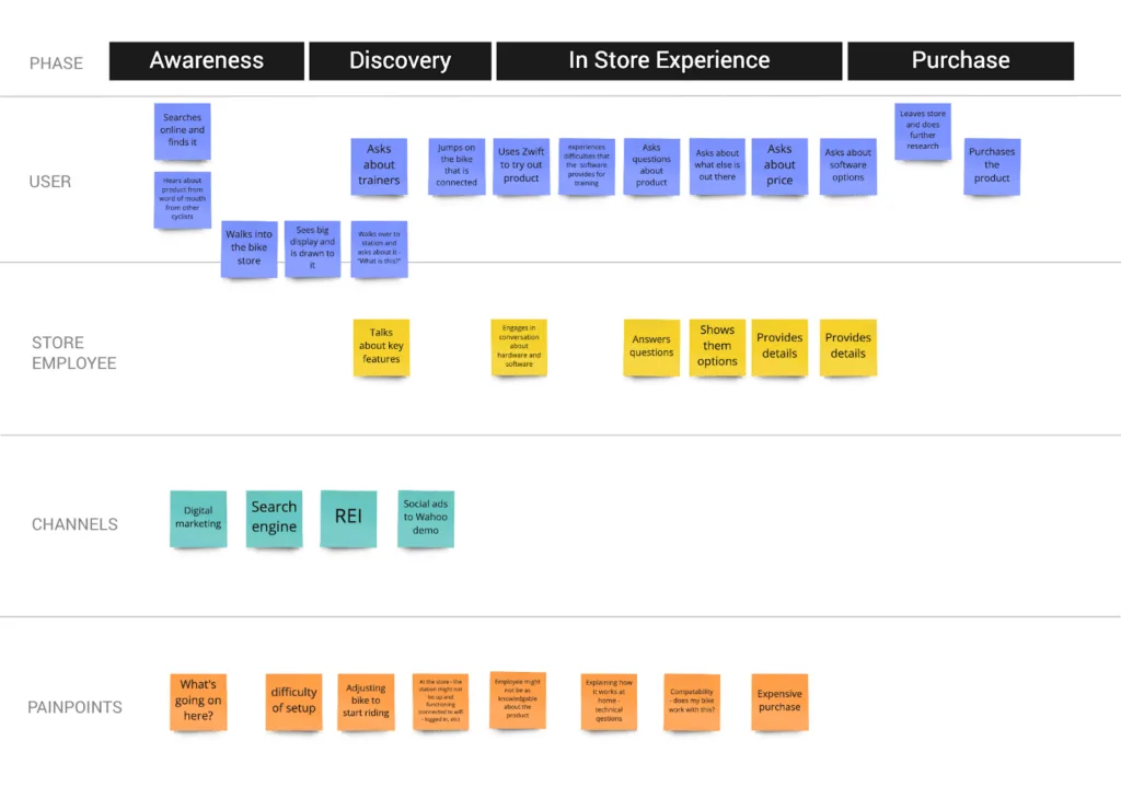
To validate Wahoo’s demo concept and align priorities, we ran a rapid proof of concept over three sprints. The POC included stakeholder workshops, competitive research, site visits, user interviews, and a functional prototype delivered via Apple TestFlight.
Alignment Workshop
Brought together product, development, marketing, and sales teams to align on product vision, user journey mapping, and service ecosystem
MSCW Prioritization
Must / Should / Could / Won’t exercise defined the roadmap for the initial engagement and guided MVP scope
Site Visits & Interviews
Visited local bike stores (Atlanta Cycling, Roswell Bikes) to observe real KICKR stations and interview employees and customers
Rapid Prototype
Delivered a functional POC app in Apple TestFlight within 6 weeks, presented to Wahoo stakeholders for feedback
POC Deliverables
Alignment workshop report, competitive research, site visit findings, user persona workflow, wireframes, visual designs, clickable prototype, solution architecture, and functional Apple TV prototype


Field research & competitive analysis
One of the most vital aspects of validating the POC was going to local bike stores and asking employees how the KICKR Experience stations were currently helping them sell. We also evaluated leading in-store demo experiences from Peloton and Tonal.
Site Visit Findings
Hands-On Demo Critical
Users need to physically ride to understand the ecosystem of products
Safety Concern
Store owners prefer to help customers rather than allow unassisted riding
Connectivity Issues
Apple TV sleep mode, lost remotes, and Bluetooth resets were universal problems
Employee Testimony Strongest
Personal recommendations from cycling-passionate employees drove the most sales
No Remote Needed
The app must work without the Apple TV remote—pedal activation is the key interaction
Correct Setup Essential
Many stores had incorrect Apple TV settings, causing sleep and connectivity failures
“The Apple TV kept going to sleep. The user was mainly seeing the Apple screensaver of waterfalls and dolphins.”
— Store employee, Atlanta Cycling (Roswell)
Competitive Research
We extended our research beyond Wahoo’s direct competitors to companies that had created unique in-store demo experiences, evaluating interactive software that promotes the benefits of exercise and training hardware.
Peloton
Personalized, hands-on demo with dedicated staff. Special shoes and socks provided. Device pre-disinfected and sized to the customer. Strong post-demo email follow-up sequence.
Key takeaway: Personal, guided experience sets the benchmark
Tonal
Remote demo experience via Zoom with knowledgeable trainer. Easy online registration. Natural conversation even in virtual format. Trainer demonstrated from their own home setup.
Key takeaway: Authentic product knowledge creates trust
From validated prototype to the App Store in 10 weeks
With the POC validated and stakeholder buy-in secured, we moved into the MVP phase—a 10-week engagement to build, test, and ship a production Apple TV app integrated with Wahoo’s cloud infrastructure.
Apple TV App
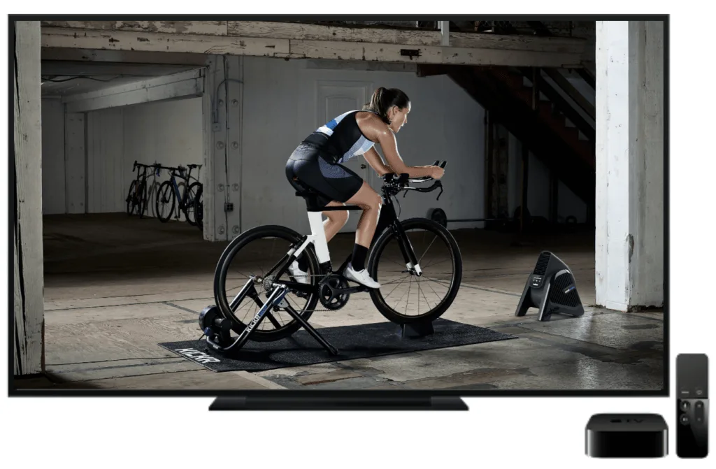
We created a native tvOS app with seamless Bluetooth integration to the KICKR hardware. The app was designed to work without the Apple TV remote—customers simply start pedaling to activate the experience.
The app manages its own wake/sleep cycle, eliminating the screensaver problem that plagued every store location.
Race Simulation
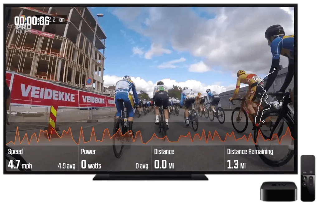
Using telemetry and Bluetooth technology, we created a real road experience simulation. The app shows speed and power (watts) the user generates in real time as they ride the KICKR Smart Trainer.
The KICKR CLIMB physically adjusts incline during the race, giving riders a tangible feel of the terrain they’re navigating on screen.
Ambient Mode & In-Store Ads
To catch customers’ attention as they walk by, we created an ambient Wahoo channel featuring commercials, product features, and sample assets. We also programmed the CLIMB product to move the bike independently using IoT code—the physical motion draws shoppers to the station.
Leaderboard & Lead Capture
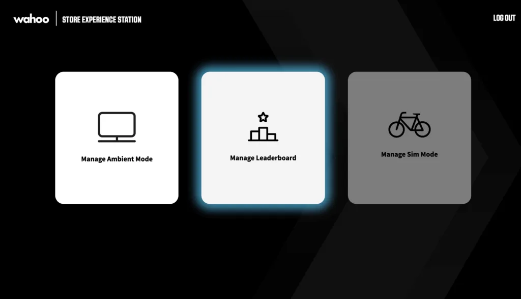
To create opportunities for in-store events and encourage repeat use, we built a leaderboard system. A QR code lets users submit their information via their phone—Wahoo can then send educational and promotional emails, building a pipeline from in-store demo to purchase.

Back-End Admin
We designed a Rails-based admin interface giving Wahoo a way to manage assets, leaderboard data, and store events. The admin also supports A/B testing for different video assets and configurations across locations.
Seven insights from real users at Wahoo stores
We took our prototype to Wahoo partner stores and tested with real users—from store employees to avid cyclists. Observing each interaction with the app and hardware revealed key improvements for the final product.
Ambient Mode Needs Motion
Users didn’t notice the TV until the CLIMB moved the bike. Physical movement is essential to attract attention.
Better Race Transition
Users didn’t know they were racing or understand the metrics. Need a 30-second free-form intro ride first.
Keep Race Graphics Simple
Users don’t notice on-screen graphics while riding. Keep the content clean and ensure graphics don’t obscure metrics.
Accurate Incline Graph
The incline representation was users’ primary focus during the race. It must show accurate progress and “distance remaining.”
Shorten the Race
At 1.3 miles, users were out of breath and couldn’t talk about the product. Under 1 mile (½–¾ mi) is ideal for comfort.
Highlight Leaderboard Position
Users had difficulty finding themselves on the list. QR code instructions need to be large and obvious.
Personalize by Store
Follow-up emails should include the store’s partner ID so communication feels local and builds trust with store owners.
From passive displays to an autonomous sales platform
Within five months of initial development, the Wahoo KICKR Experience Station app launched in retail stores worldwide—providing customers with an enhanced first impression and education around the full Wahoo ecosystem.
Before
Relied on store employees to demo the product
No customer tracking or lead capture
Limited to showcasing a single product
No station usage data or analytics
Static experience stations with screensavers
Dependent on third-party apps (Zwift)
After
Automated product advertising without employees
Tied to Wahoo accounts & store sales via QR code
Full KICKR + CLIMB + HEADWIND ecosystem demo
Real-time store analytics via Segment events
Dynamic bike movement (CLIMB) attracts shoppers
100% Wahoo-controlled experience
Engagement Metrics Tracked
With Segment analytics integrated across every station, Wahoo now tracks:
Rides started (by store)
Rides completed (by store)
Rides aborted (by store)
Emails captured (by store)
Wahoo ads displayed (by store)
Inactive stations flagged
Integrated hardware, software, and cloud
The solution connects the Apple TV app to Wahoo’s KICKR hardware via Bluetooth, with a Ruby on Rails API managing leaderboard data, QR codes, and user data. Store analytics flow through Segment, and the Wahoo Cloud handles account authentication and .fit file storage.


“Digital Scientists helped us drive sales for our KICKR Smart Trainer by developing an innovative and interactive Apple TV app that helps engage and educate our customers. The KICKR experience stations make up some of our most important real estate, but we needed help attracting customers to the stations. The DS team was able to accelerate these efforts and help us truly engage with potential buyers.”
Tyler Harris
Wahooligan Product Owner
Have an iOS project in mind?
Let's talk about how Digital Scientists can help with your next project.